TL;DR
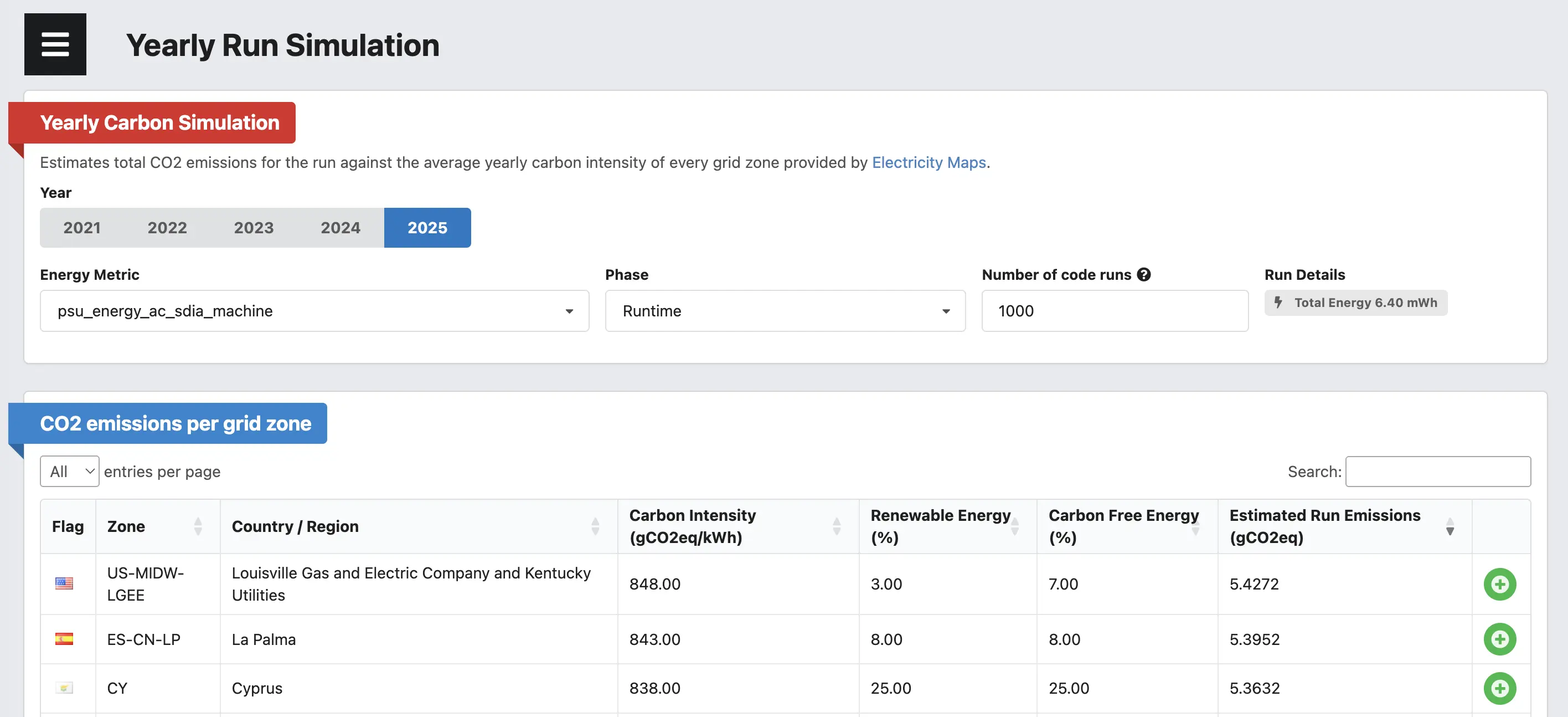
- The Green Metrics Tool now has a Yearly Run Simulation view that projects any run's measured energy against the average yearly carbon intensity of every Electricity Maps grid zone, for 2021 – 2025.
- Pick a year, energy metric, phase and number of runs — get a sortable table of estimated emissions per zone, plus renewable and carbon-free energy share.
- Pin zones side-by-side to compare regions and years at a glance, instead of relying on a single, falsely precise CO2 number.
One of the most frequent questions we get when people see a Green Metrics Tool measurement for the first time is some variant of: “OK, but what does this actually mean in CO2?” Answering that honestly is harder than it looks. A run measured in our lab tells you how many Joules a piece of software consumed on a specific machine — but the carbon footprint of those Joules depends entirely on where and when the electricity was produced. A workload that emits a few grams of CO2 in Sweden can emit ten times as much in Poland, India or the United Arab Emirates. For this simulation, we don’t take embodied emissions into account, although these are still really important.
Up to now, our UI mostly answered this with a single number derived from a single grid mix. We wanted to give users a way to see the full picture at a glance. With this feature we are introducing a new view to the Green Metrics Tool: the Yearly Run Simulation.
See it live 👉 here for a Wordpress workload.
What it does
The new view takes any existing run and projects its measured energy consumption against the average yearly carbon intensity of every grid zone that Electricity Maps publishes — for the years 2021 through 2025. So instead of one number you get a sortable, searchable, filterable table that answers questions like:
- How would the same run have looked if it had executed in different zones?
- How has the emission profile of running my software in Germany changed between 2021 and 2025?
- If I run this benchmark a thousand times over the year on a low-carbon grid, how much CO2 do I save compared to a fossil-heavy zone?
The simulation is reachable from the normal stats page of any run via a new link.
We tried hard to keep the UI minimal but to expose the few knobs that actually change the result:
- Year: pick one of
2021 – 2025.
- Energy Metric: by default we pick
psu_energy_ac_mcp_machine if it is available — that is the AC wall-plug measurement and the most accurate proxy for what the data center would actually be billed for. If no PSU metric exists we fall back to whatever *_energy_* metrics the run produced.
- Phase: defaults to
[RUNTIME], but you can switch to Installation, Boot, Remove or any other phase the run captured. This is particularly useful for a Software Life Cycle Assessment where the install or remove phase can dominate the energy budget — see our earlier write-up on SLCA done in the wild.
- Number of code runs: software is rarely run once. The default of
1000 lets you reason about realistic usage rather than a single execution.
How the table works
For every zone we show:
- The Electricity Maps zone code and a human-readable name.
- The yearly average Carbon Intensity in
gCO2eq/kWh.
- The share of Renewable Energy and Carbon Free Energy (which includes nuclear) for the year.
- The Estimated Run Emissions in
gCO2eq, computed as total_run_energy_kWh * carbon_intensity * num_runs.
The table is sorted by emissions descending by default, so the worst-case zones bubble to the top. You can search by country, sort by any column, and pick a page length up to “All” — there are roughly 200 zones.
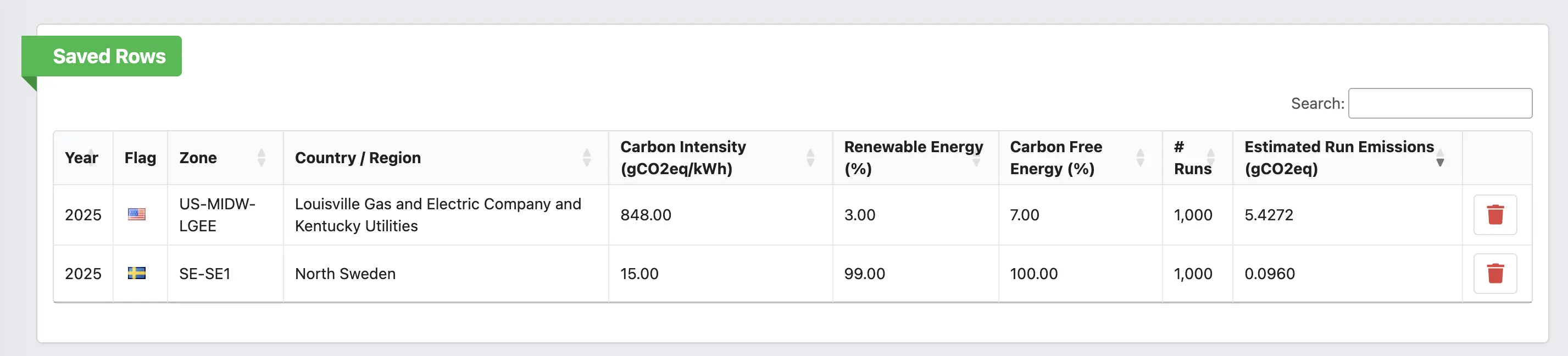
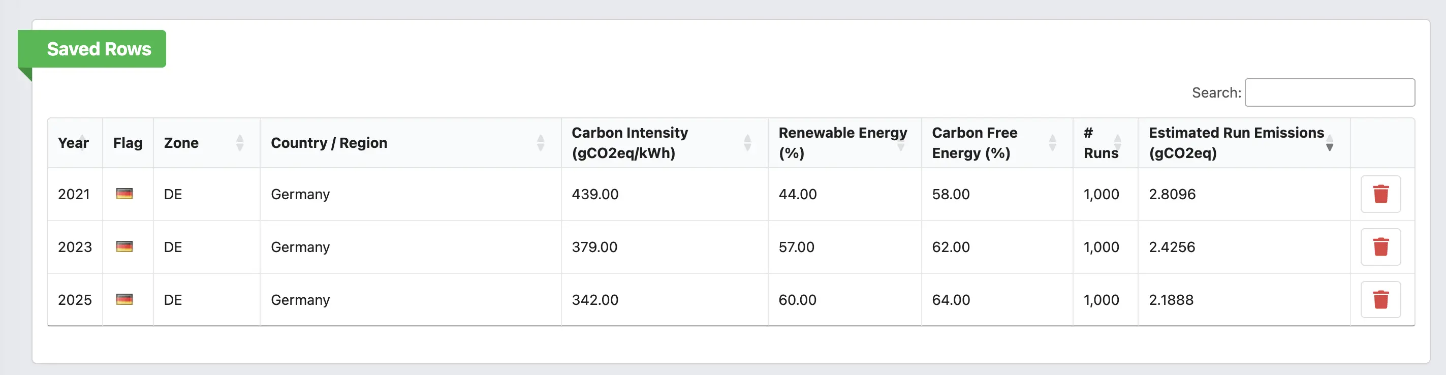
Every row also has a small "+" button to push it into a Saved Rows card at the top of the page. This is the part of the UI we use the most ourselves: pin Germany 2021, Germany 2025, France 2025 and India 2025 next to each other and you immediately see two things — the slow but real decarbonization of the German grid over five years, and how dramatic the spread between zones still is in any given year.
Why this matters
Carbon-aware reasoning about software has, for years, suffered from a chicken-and-egg problem: developers don’t quote CO2 numbers because the numbers are too uncertain to quote, and the numbers stay uncertain because nobody quotes them and asks for better ones. We think the right answer is not to pretend we have a single global number — it is to be transparent about the spread.
Showing the same run against every zone for every recent year does exactly that. It puts an honest range in front of the developer instead of a falsely precise single value, and it gives a concrete, defensible answer to the inevitable “depends on where you run it” objection: yes, it depends, and here is the full distribution.
This also slots neatly into the methodology we sketched in Carbon Aware Development. Once you have benchmark numbers in Joules, you can now turn them into a CO2 distribution with a couple of clicks, save the zones you actually deploy in, and feed those numbers back into your design decisions.
Data, attribution and caveats
All grid data comes from the wonderful folks at Electricity Maps, distributed via the co2.js project from The Green Web Foundation. A great thank you goes out for helping with this data. We bundle the yearly aggregates directly with the frontend so the simulation works without any external API calls and stays usable in air-gapped or offline deployments.
A few caveats worth keeping in mind:
- These are yearly averages, not real-time intensities. They are great for long-running workloads or for “what if this ran continuously over a year” questions, but they will under- or over-state emissions for a workload that is heavily concentrated in particular hours of the day.
- The simulation multiplies the measured runtime energy by the chosen carbon intensity. Embodied hardware emissions are not part of this view yet; for those, see our work on the embodied carbon tooling we are wiring into the GMT.
